Designing for Scale
Designed a bulk feature for finance team to manage disbursement transactions at scale.
Scroll to solution

Role
Product Designer
Team
Design Manager
Product Manager
Engineers
Finance
Challenge
I led the design of a bulk disbursement feature for Credr, a loan management platform. At the time, over 80% of loan volume came from partners that operated in bulk. Yet, Credr’s interface required users to process every loan one-by-one. This manual model resulted in significant time waste, high error rates, and a hard limit on how fast and frequently disbursements could happen.
The goal was to shift the model from individual transactions to bulk workflows, unlocking operational scale while reducing cognitive load for finance users. The feature not only streamlined disbursement but laid the foundation for broader bulk-processing capabilities such as repayments and KYC verification.
Loan Operations Were Manual and Couldn’t Scale
Through a mix of data analysis and user interviews, we uncovered just how costly the current system was. During a typical week in January 2025, finance teams handled 400 manual transactions (200 disbursements + 200 repayments), each taking 2–3 minutes. That translated to 15–24 hours weekly — nearly three full workdays — spent on repetitive entry alone.
The process limited disbursements to two windows daily, causing delays in fund delivery to borrowers. With increasing volume, this workflow became the main bottleneck in our operations.
Our goal was to cut processing time by 85–90%, increase disbursement frequency, and enable the system to scale with partner volume without adding staff. This was a step toward broader operational changes, paving the way for bulk workflows in repayments and KYC, focusing on speed and long-term growth.
The goal was to reduce the time taken in creating transactions by 80-90% to make operations more scalable.
Finding What Mattered to Finance Teams
In financial operations, particularly when disbursing millions in loans, accuracy is crucial. Mistakes can be costly and damage trust. We realized we needed to help teams not only speed up but do so with confidence, providing clarity, control, and visibility throughout the process.
Defined design principles based on discovery sessions with the team to understand what matters to the team.
Actioning Errors Caused the Most Friction: Testing the First Concept With Subtle Error Messaging and Icons
The first prototype featured subtle helper text and minimal iconography to flag issues. We assumed that it was clean and easy to scan. However, while testing, users processing large files missed critical error messages and became frustrated when they were blocked from execution without understanding why.
Critical tasks need more visible cues and stronger guidance.
Testing Urgent Errors to Draw More Emphasis
The next version featured bold red text and inline error alerts throughout the file. While users immediately noticed the issues, it quickly became overwhelming. While we explained the error, the action required was not clear. Teams described they had difficulty knowing which issues were actually blocking progress, and which weren’t.
When everything feels urgent, it just creates chaos. Not every alert has to shout for your attention.
The Final Version: Used Summaries and Tags to Draw Attention
Then I applied this after studying how error states are displayed in a tables - and all of them use tags to indicate that a row has an error or warning. I combined this with the summary to display pending actions from the user to present errors and warnings with more clarity.
Summaries improve focus, and consistent use of tags makes error-handling intuitive.
Final Design
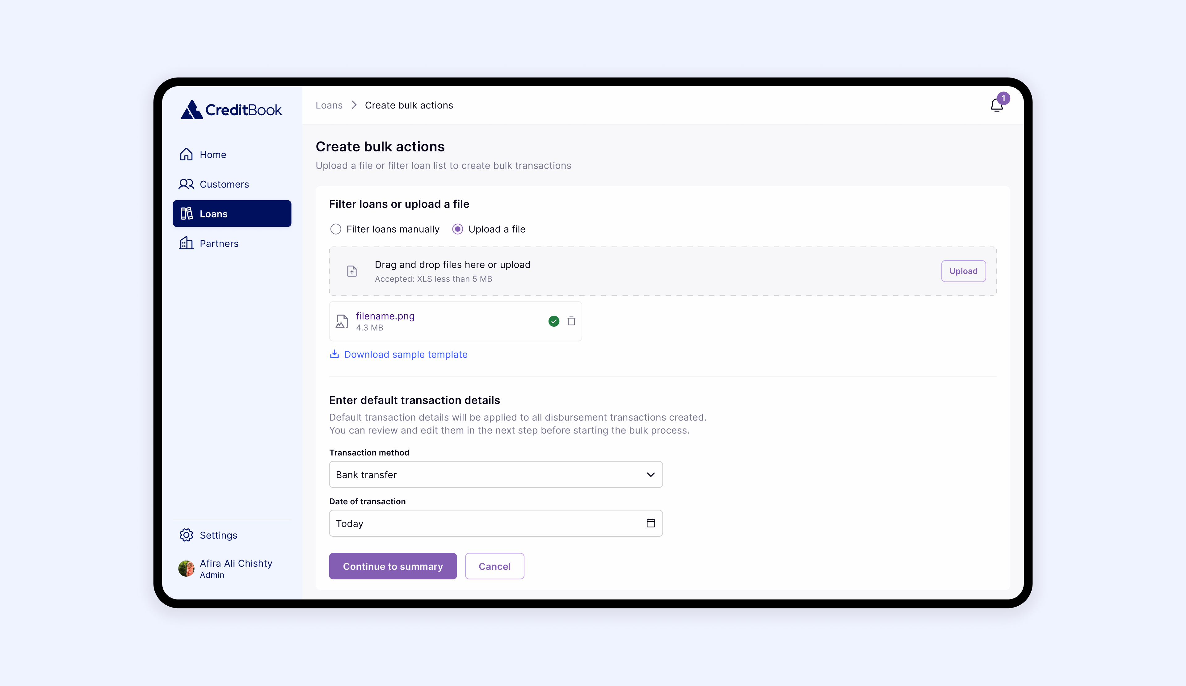
The final design introduced a bulk workflow that gave finance teams a smarter, more structured way to manage large volumes of loans. Users could now initiate bulk actions directly from the loans page and choose from a set of predefined operations based on their access level. From there, they had the flexibility to either upload a CSV file or use filters to select loans directly within the platform.
Users can choose which bulk action they would like to perform
To introduce flexibility on the platform, users are able to choose filtering loans from the Loan Management System, or uploading their own file.
Before processing the file, users can see the summary of loans. Automated errors and warnings prompt users incase the system fetches duplicate loans (with duplicate IDs, amounts and applicant - and how to resolve them.
Since auto disbursements in bulk are highly critical actions, we introduced feedback pages - differently from snackbars or confirmations in pop-ups. Finance teams needed full transparency about everything
Impact
Time spent on disbursements dropped from 15–24 hours to just 2 hours per week, a 91% reduction. The number of daily disbursement windows increased from 2 to on-demand, enabling faster loan processing and better service for borrowers.
The team could now support a growing number of partners without needing to hire proportionally, a critical shift for scale. Most importantly, this feature laid the groundwork for bulk repayment and KYC processing, using the same interaction patterns and design principles.
Thanks for reading. See my other work.
Design for Employees


afira.chishty@gmail.com
Designing for Scale
Designed a bulk feature for finance team to manage disbursement transactions at scale.
Scroll to solution
Role
Product Designer
Team
Design Manager
Product Manager
Engineers
Finance
Challenge
I led the design of a bulk disbursement feature for Credr, a loan management platform. At the time, over 80% of loan volume came from partners that operated in bulk. Yet, Credr’s interface required users to process every loan one-by-one. This manual model resulted in significant time waste, high error rates, and a hard limit on how fast and frequently disbursements could happen.
The goal was to shift the model from individual transactions to bulk workflows, unlocking operational scale while reducing cognitive load for finance users. The feature not only streamlined disbursement but laid the foundation for broader bulk-processing capabilities such as repayments and KYC verification.
Loan Operations Were Manual and Couldn’t Scale
Through a mix of data analysis and user interviews, we uncovered just how costly the current system was. During a typical week in January 2025, finance teams handled 400 manual transactions (200 disbursements + 200 repayments), each taking 2–3 minutes. That translated to 15–24 hours weekly — nearly three full workdays — spent on repetitive entry alone.
The process limited disbursements to two windows daily, causing delays in fund delivery to borrowers. With increasing volume, this workflow became the main bottleneck in our operations.
Our goal was to cut processing time by 85–90%, increase disbursement frequency, and enable the system to scale with partner volume without adding staff. This was a step toward broader operational changes, paving the way for bulk workflows in repayments and KYC, focusing on speed and long-term growth.
The goal was to reduce the time taken in creating transactions by 80-90% to make operations more scalable.
Finding What Mattered to Finance Teams
In financial operations, particularly when disbursing millions in loans, accuracy is crucial. Mistakes can be costly and damage trust. We realized we needed to help teams not only speed up but do so with confidence, providing clarity, control, and visibility throughout the process.
Defined design principles based on discovery sessions with the team to understand what matters to the team.
Actioning Errors Caused the Most Friction: Testing the First Concept With Subtle Error Messaging and Icons
The first prototype featured subtle helper text and minimal iconography to flag issues. We assumed that it was clean and easy to scan. However, while testing, users processing large files missed critical error messages and became frustrated when they were blocked from execution without understanding why.
Critical tasks need more visible cues and stronger guidance.
Testing Urgent Errors to Draw More Emphasis
The next version featured bold red text and inline error alerts throughout the file. While users immediately noticed the issues, it quickly became overwhelming. While we explained the error, the action required was not clear. Teams described they had difficulty knowing which issues were actually blocking progress, and which weren’t.
When everything feels urgent, it just creates chaos. Not every alert has to shout for your attention.
The Final Version: Used Summaries and Tags to Draw Attention
Then I applied this after studying how error states are displayed in a tables - and all of them use tags to indicate that a row has an error or warning. I combined this with the summary to display pending actions from the user to present errors and warnings with more clarity.
Summaries improve focus, and consistent use of tags makes error-handling intuitive.
Final Design
The final design introduced a bulk workflow that gave finance teams a smarter, more structured way to manage large volumes of loans. Users could now initiate bulk actions directly from the loans page and choose from a set of predefined operations based on their access level. From there, they had the flexibility to either upload a CSV file or use filters to select loans directly within the platform.
Users can choose which bulk action they would like to perform
To introduce flexibility on the platform, users are able to choose filtering loans from the Loan Management System, or uploading their own file.
Before processing the file, users can see the summary of loans. Automated errors and warnings prompt users incase the system fetches duplicate loans (with duplicate IDs, amounts and applicant - and how to resolve them.
Since auto disbursements in bulk are highly critical actions, we introduced feedback pages - differently from snackbars or confirmations in pop-ups. Finance teams needed full transparency about everything
Impact
Time spent on disbursements dropped from 15–24 hours to just 2 hours per week, a 91% reduction. The number of daily disbursement windows increased from 2 to on-demand, enabling faster loan processing and better service for borrowers.
The team could now support a growing number of partners without needing to hire proportionally, a critical shift for scale. Most importantly, this feature laid the groundwork for bulk repayment and KYC processing, using the same interaction patterns and design principles.
Thanks for reading. See my other work.
Next: Design for Employees
afira.chishty@gmail.com
Designing for Scale
Designed a bulk feature for finance team to manage disbursement transactions at scale.
Scroll to solution
Role
Product Designer
Team
Design Manager
Product Manager
Engineers
Finance
Challenge
I led the design of a bulk disbursement feature for Credr, a loan management platform. At the time, over 80% of loan volume came from partners that operated in bulk. Yet, Credr’s interface required users to process every loan one-by-one. This manual model resulted in significant time waste, high error rates, and a hard limit on how fast and frequently disbursements could happen.
The goal was to shift the model from individual transactions to bulk workflows, unlocking operational scale while reducing cognitive load for finance users. The feature not only streamlined disbursement but laid the foundation for broader bulk-processing capabilities such as repayments and KYC verification.
Loan Operations Were Manual and Couldn’t Scale
By analyzing data and conducting user interviews, we discovered the high costs of the current system. In a typical week, finance teams processed 400 manual transactions, each taking 2–3 minutes, totaling 15–24 hours weekly, almost three full workdays, on on repetitive entry.
The process limited disbursements to two windows daily, causing delays in fund delivery to borrowers. With increasing volume, this workflow became the main bottleneck in our operations.
Our goal was to cut processing time by 85–90%, increase disbursement frequency, and enable the system to scale with partner volume without adding staff. This was a step toward broader operational changes, paving the way for bulk workflows in repayments and KYC, focusing on speed and long-term growth.
The goal was to reduce the time taken in creating transactions by 80-90% to make operations more scalable.
Finding What Mattered to Finance Teams
In financial operations, particularly when disbursing millions in loans, accuracy is crucial. Mistakes can be costly and damage trust. We realized we needed to help teams not only speed up but do so with confidence, providing clarity, control, and visibility throughout the process.
Defined design principles based on discovery sessions with the team to understand what matters to the team.
Actioning Errors Caused the Most Friction: Testing the First Concept With Subtle Error Messaging and Icons
The first prototype featured subtle helper text and minimal iconography to flag issues. We assumed that it was clean and easy to scan. However, while testing, users processing large files missed critical error messages and became frustrated when they were blocked from execution without understanding why.
Critical tasks need more visible cues and stronger guidance.
Testing Urgent Errors to Draw More Emphasis
The next version featured bold red text and inline error alerts throughout the file. While users immediately noticed the issues, it quickly became overwhelming. While we explained the error, the action required was not clear. Teams described they had difficulty knowing which issues were actually blocking progress, and which weren’t.
Required action from the user was more important than only highlighting the error.
The Final Version: Used Summaries and Tags to Draw Attention
Then I applied this after studying how error states are displayed in a tables - and all of them use tags to indicate that a row has an error or warning. I combined this with the summary to display pending actions from the user to present errors and warnings with more clarity.
Summaries improve focus, and consistent use of tags makes error-handling intuitive.
Final Design
The final design introduced a bulk workflow that gave finance teams a smarter, more structured way to manage large volumes of loans. Users could now initiate bulk actions directly from the loans page and choose from a set of predefined operations based on their access level. From there, they had the flexibility to either upload a CSV file or use filters to select loans directly within the platform.
Users can choose which bulk action they would like to perform
To introduce flexibility on the platform, users are able to choose filtering loans from the Loan Management System, or uploading their own file.
Before processing the file, users can see the summary of loans. Automated errors and warnings prompt users incase the system fetches duplicate loans (with duplicate IDs, amounts and applicant - and how to resolve them.
Since auto disbursements in bulk are highly critical actions, we introduced feedback pages - differently from snack-bar or confirmations in pop-ups. Finance teams needed full transparency about processing state.
Impact
Time spent on disbursements dropped from 15–24 hours to just 2 hours per week, a 91% reduction. The number of daily disbursement windows increased from 2 to on-demand, enabling faster loan processing and better service for borrowers.
The team could now support a growing number of partners without needing to hire proportionally, a critical shift for scale. Most importantly, this feature laid the groundwork for bulk repayment and KYC processing, using the same interaction patterns and design principles.
Thanks for reading. See my other work.
Next: Design for Employees
afira.chishty@gmail.com