Designing for Consistency
Developed scalable layouts and templates for a loan management system, aiming to streamline hand-offs and ensure consistency.
Scroll to solution

Role
Product Designer
Team
Design Manager
Product Manager
Engineers
Brand Manager
Project Overview
CreditBook’s Lending Management System (called Credr) started as an internal tool meant to manage internal operations. As such, it bypassed the usual design → engineering cycle and directly went to development. Later, as CreditBook transitioned to a SaaS offering, it became crucial to align the product with a revamped brand, accommodate new user flows, and deliver a more consistent experience. Rebuilding the layouts was essential not only for usability but also for scaling the product team’s delivery and minimizing confusion that arose with inconsistency.
Building the Foundations
To overcome existing tool limitations, I led two future-state co-creation workshops with product, operations, and engineering teams. This collaboration focused on mapping ideal workflows and states, highlighting key needs for speed and clarity in high-risk workflows, reduced application switching, and enhanced visibility into changes and decision history.
Since this was the first time building with a design system, there were no established product design principles to rely on. They had to be built from scratch - and were defined by our users.
Conducted co-creation workshops to define our product design principles
Referring To Other Complex Industries, And Real User Feedback
To design layouts that supported real workflows, we combined competitor research with inspiration from industries known for handling complexity. We analyzed local and global fintech tools, lending platforms, dashboards, and accounting apps to understand common layout patterns. This helped us identify what worked (summaries, modular information, wide areas for high intensity workflows, simple column grid structures) and what didn’t (text heavy areas, dense cards)
We also looked beyond fintech. Industries like healthcare, logistics, immigration, and education deal with complex, high-stakes workflows daily. From them, we learned how to structure high-density screens, enable fast decision-making, and surface action history in ways that build trust and reduce error.
Screens showcasing WIP after industry analysis and feedback from our users.
Building Standardized Layouts
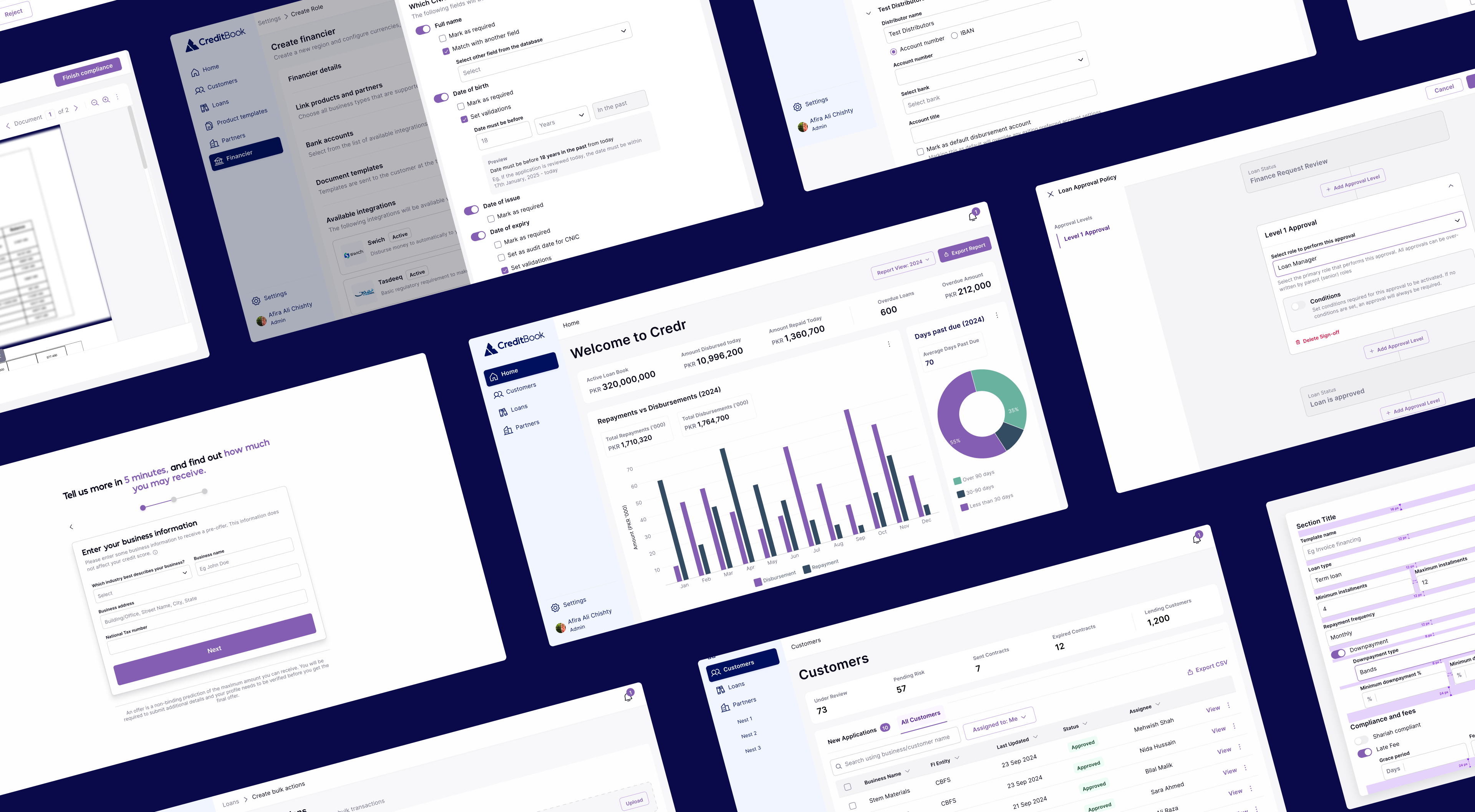
Each layout adhered to a consistent grid system, spacing tokens, visual hierarchy, and established rules for action placement. Several pages and layouts were created, discussed, iterated for improved or enhanced UX. The entire platform could actually be made through some repeated templates. Some templates are shown below.
1. Templates for Cards and Data Visualization
Pages were standardized using a card-based layout. For pages containing large volumes of information, a consistent “Status Card” was placed at the top. This card displayed 5–6 key metrics, helping users quickly assess the most relevant data at a glance. Data visualizations followed a defined set of guidelines and color schemes, tailored to the type and priority of data being presented, ensuring both clarity and consistency across the platform.
2. Layout for Focused Workflows
Some actions on the platform, such as verifying document compliance and identity details, demanded high-intensity workflows and focused attention. To support this, a dedicated layout was developed based on cross-industry best practices and insights from internal user behavior.
This layout utilized the full width of the screen to reduce visual clutter and maximize focus. Later, scroll-based interactions were introduced, allowing users to seamlessly move to the next decision point after completing one, improving efficiency and flow in repetitive review tasks.
3. Basic Forms
Forms were one of the most critical and frequently used layouts on Credr. They were essential for tasks such as creating products, setting up partners, configuring plugins, and managing regional setups and so on. In the initial phase of the design system layout exercise, we focused on creating a standardized basic form layout, complete with defined spacing guidelines and structural rules (to define the grouping of fields and sections and button groupings) to ensure consistency and ease of use across the platform.
Layouts Needed Flexibility With Scale
As the system scaled, we realized that basic forms did not have the best UX considering multiple use cases. Some forms needed to be placed in context of of one screen, while other times, the number of inputs in form created immense congnitive overload.
4. Advanced Forms: Interaction Based
Some workflows were far too complex (such as product configurations) and went over 20 fields in a single page. Initially, within basic forms, these fields were displayed all at once creating an information overload. I further enhanced the form layout by introducing interactions and progressive disclosure. If a form was to have more than 4 sections, the form must have accordions with only one accordion expanded at a time.
5. Drawer-Based Forms: Forms as Subtasks
Some workflows required forms to be displayed within drawers, especially when a form was embedded inside another. I introduced the drawer-based layout to ensure smooth transitions and maintain a clear visual hierarchy, helping users stay oriented and focused throughout the interaction. This approach allowed users to complete secondary tasks without losing context of the primary flow.
6. Wizard Style Forms
Certain forms were designed to be linear, particularly during onboarding or setup flows, where each section depended on inputs from the previous one. These scenarios often introduced cognitive load, as users had to complete multiple steps in sequence. To address this, wizard-style forms were introduced. They broke the process into manageable steps, guiding users through one section at a time and reducing overwhelm, while maintaining a clear sense of progress.
Impact of Standardizing Page Layouts
30–40% faster design-to-dev cycles. Shared layouts, rules and documentation significantly reduced time spent on visual decisions and handoff clarifications.
Design critiques were more focused with fewer rounds required to deliver, mostly on the UX of journeys, as opposed to visual designs.
Engineering collaboration improved. Designs became easier to interpret and implement. Engineers and designers used the same system and language, even for designs that directly implemented by the dev team.
Thanks for reading.
See my other work.
Design for Investors


afira.chishty@gmail.com
Designing for Consistency
Developed scalable layouts and templates for a loan management system, aiming to streamline hand-offs and ensure consistency.
Scroll to solution
Role
Product Designer
Team
Design Manager
Product Manager
Engineers
Brand Manager
Project Overview
CreditBook’s Lending Management System (called Credr) started as an internal tool meant to manage internal operations. As such, it bypassed the usual design → engineering cycle and directly went to development. Later, as CreditBook transitioned to a SaaS offering, it became crucial to align the product with a revamped brand, accommodate new user flows, and deliver a more consistent experience. Rebuilding the layouts was essential not only for usability but also for scaling the product team’s delivery and minimizing confusion that arose with inconsistency.
Building the Foundations
To overcome existing tool limitations, I led two future-state co-creation workshops with product, operations, and engineering teams. This collaboration focused on mapping ideal workflows and states, highlighting key needs for speed and clarity in high-risk workflows, reduced application switching, and enhanced visibility into changes and decision history.
Since this was the first time building with a design system, there were no established product design principles to rely on. They had to be built from scratch - and were defined by our users.
Conducted co-creation workshops to define our product design principles
Referring To Other Complex Industries, And Real User Feedback
To design layouts that supported real workflows, we combined competitor research with inspiration from industries known for handling complexity. We analyzed local and global fintech tools, lending platforms, dashboards, and accounting apps to understand common layout patterns. This helped us identify what worked (summaries, modular information, wide areas for high intensity workflows, simple column grid structures) and what didn’t (text heavy areas, dense cards)
We also looked beyond fintech. Industries like healthcare, logistics, immigration, and education deal with complex, high-stakes workflows daily. From them, we learned how to structure high-density screens, enable fast decision-making, and surface action history in ways that build trust and reduce error.
Screens showcasing WIP after industry analysis and feedback from our users.
Building Standardized Layouts
Each layout adhered to a consistent grid system, spacing tokens, visual hierarchy, and established rules for action placement. Several pages and layouts were created, discussed, iterated for improved or enhanced UX. The entire platform could actually be made through some repeated templates. Some templates are shown below.
1. Templates for Cards and Data Visualization
Pages were standardized using a card-based layout. For pages containing large volumes of information, a consistent “Status Card” was placed at the top. This card displayed 5–6 key metrics, helping users quickly assess the most relevant data at a glance. Data visualizations followed a defined set of guidelines and color schemes, tailored to the type and priority of data being presented, ensuring both clarity and consistency across the platform.
2. Layout for Focused Workflows
Some actions on the platform, such as verifying document compliance and identity details, demanded high-intensity workflows and focused attention. To support this, a dedicated layout was developed based on cross-industry best practices and insights from internal user behavior.
This layout utilized the full width of the screen to reduce visual clutter and maximize focus. Later, scroll-based interactions were introduced, allowing users to seamlessly move to the next decision point after completing one, improving efficiency and flow in repetitive review tasks.
3. Basic Forms
Forms were one of the most critical and frequently used layouts on Credr. They were essential for tasks such as creating products, setting up partners, configuring plugins, and managing regional setups and so on. In the initial phase of the design system layout exercise, we focused on creating a standardized basic form layout, complete with defined spacing guidelines and structural rules (to define the grouping of fields and sections and button groupings) to ensure consistency and ease of use across the platform.
Layouts Needed Flexibility With Scale
As the system scaled, we realized that basic forms did not have the best UX considering multiple use cases. Some forms needed to be placed in context of of one screen, while other times, the number of inputs in form created immense congnitive overload.
4. Advanced Forms: Interaction Based
Some workflows were far too complex (such as product configurations) and went over 20 fields in a single page. Initially, within basic forms, these fields were displayed all at once creating an information overload. I further enhanced the form layout by introducing interactions and progressive disclosure. If a form was to have more than 4 sections, the form must have accordions with only one accordion expanded at a time.
5. Drawer-Based Forms: Forms as Subtasks
Some workflows required forms to be displayed within drawers, especially when a form was embedded inside another. I introduced the drawer-based layout to ensure smooth transitions and maintain a clear visual hierarchy, helping users stay oriented and focused throughout the interaction. This approach allowed users to complete secondary tasks without losing context of the primary flow.
6. Wizard Style Forms
Certain forms were designed to be linear, particularly during onboarding or setup flows, where each section depended on inputs from the previous one. These scenarios often introduced cognitive load, as users had to complete multiple steps in sequence. To address this, wizard-style forms were introduced. They broke the process into manageable steps, guiding users through one section at a time and reducing overwhelm, while maintaining a clear sense of progress.
Impact of Standardizing Page Layouts
30–40% faster design-to-dev cycles. Shared layouts, rules and documentation significantly reduced time spent on visual decisions and handoff clarifications.
Design critiques were more focused with fewer rounds required to deliver, mostly on the UX of journeys, as opposed to visual designs.
Engineering collaboration improved. Designs became easier to interpret and implement. Engineers and designers used the same system and language, even for designs that directly implemented by the dev team.
Thanks for reading. See my other work.
Next: Design for Investors
afira.chishty@gmail.com
Designing for Consistency
Developed scalable layouts and templates for a loan management system, aiming to streamline hand-offs and ensure consistency.
Scroll to solution
Role
Product Designer
Team
Design Manager
Product Manager
Engineers
Brand Manager
Project Overview
CreditBook’s Lending Management System (called Credr) started as an internal tool meant to manage internal operations. As such, it bypassed the usual design → engineering cycle and directly went to development. Later, as CreditBook transitioned to a SaaS offering, it became crucial to align the product with a revamped brand, accommodate new user flows, and deliver a more consistent experience. Rebuilding the layouts was essential not only for usability but also for scaling the product team’s delivery and minimizing confusion that arose with inconsistency.
Building the Foundations
To overcome existing tool limitations, I led two future-state co-creation workshops with product, operations, and engineering teams. This collaboration focused on mapping ideal workflows and states, highlighting key needs for speed and clarity in high-risk workflows, reduced application switching, and enhanced visibility into changes and decision history.
Since this was the first time building with a design system, there were no established product design principles to rely on. They had to be built from scratch - and were defined by our users.
Conducted co-creation workshops to define our product design principles
Referring To Other Industries and Real User Feedback
To design layouts that supported real workflows, we combined competitor research with inspiration from industries known for handling complexity. We analyzed local and global fintech tools, lending platforms, dashboards, and accounting apps to understand common layout patterns. This helped us identify what worked (summaries, modular information, wide areas for high intensity workflows, simple column grid structures) and what didn’t (text heavy areas, dense cards)
We also looked beyond fintech. Industries like healthcare, logistics, immigration, and education deal with complex, high-stakes workflows daily. From them, we learned how to structure high-density screens, enable fast decision-making, and surface action history in ways that build trust and reduce error.
Screens showcasing WIP after industry analysis and feedback from our users.
Building Standardized Layouts
Each layout adhered to a consistent grid system, spacing tokens, visual hierarchy, and established rules for action placement. Several pages and layouts were created, discussed, iterated for improved or enhanced UX. The entire platform could actually be made through some repeated templates. Some templates are shown below.
1. Templates for Cards and Data Visualization
Pages were standardized using a card-based layout. For pages containing large volumes of information, a consistent “Status Card” was placed at the top. This card displayed 5–6 key metrics, helping users quickly assess the most relevant data at a glance. Data visualizations followed a defined set of guidelines and color schemes, tailored to the type and priority of data being presented, ensuring both clarity and consistency across the platform.
2. Layout for Focused Workflows
Some actions on the platform, such as verifying document compliance and identity details, demanded high-intensity workflows and focused attention. To support this, a dedicated layout was developed based on cross-industry best practices and insights from internal user behavior.
This layout utilized the full width of the screen to reduce visual clutter and maximize focus. Later, scroll-based interactions were introduced, allowing users to seamlessly move to the next decision point after completing one, improving efficiency and flow in repetitive review tasks.
3. Basic Forms
Forms were one of the most critical and frequently used layouts on Credr. They were essential for tasks such as creating products, setting up partners, configuring plugins, and managing regional setups and so on. In the initial phase of the design system layout exercise, we focused on creating a standardized basic form layout, complete with defined spacing guidelines and structural rules (to define the grouping of fields and sections and button groupings) to ensure consistency and ease of use across the platform.
Layouts Needed Flexibility With Scale
As the system scaled, we realized that basic forms did not have the best UX considering multiple use cases. Some forms needed to be placed in context of of one screen, while other times, the number of inputs in form created immense cognitive overload. Some forms were long enough to increase drop-offs mid way. We needed to introduce form interactions and layouts keeping this in mind.
4. Advanced Forms: Interaction Based
Some workflows were far too complex (such as product configurations) and went over 20 fields in a single page. Initially, within basic forms, these fields were displayed all at once creating an information overload. I further enhanced the form layout by introducing interactions and progressive disclosure. If a form was to have more than 4 sections, the form must have accordions with only one accordion expanded at a time.
5. Drawer-Based Forms: Forms as Subtasks
Some workflows required forms to be displayed within drawers, especially when a form was embedded inside another. I introduced the drawer-based layout to ensure smooth transitions and maintain a clear visual hierarchy, helping users stay oriented and focused throughout the interaction. This approach allowed users to complete secondary tasks without losing context of the primary flow.
6. Wizard Style Forms
Certain forms were designed to be linear, particularly during onboarding or setup flows, where each section depended on inputs from the previous one. These scenarios often introduced cognitive load, as users had to complete multiple steps in sequence. To address this, wizard-style forms were introduced. They broke the process into manageable steps, guiding users through one section at a time and reducing overwhelm, while maintaining a clear sense of progress.
Impact of Standardizing Page Layouts
30–40% faster design-to-dev cycles. Shared layouts, rules and documentation significantly reduced time spent on visual decisions and handoff clarifications.
Design critiques were more focused with fewer rounds required to deliver, mostly on the UX of journeys, as opposed to visual designs.
Engineering collaboration improved. Designs became easier to interpret and implement. Engineers and designers used the same system and language, even for designs that directly implemented by the dev team.
Thanks for reading. See my other work.
Next: Design for Investors
afira.chishty@gmail.com